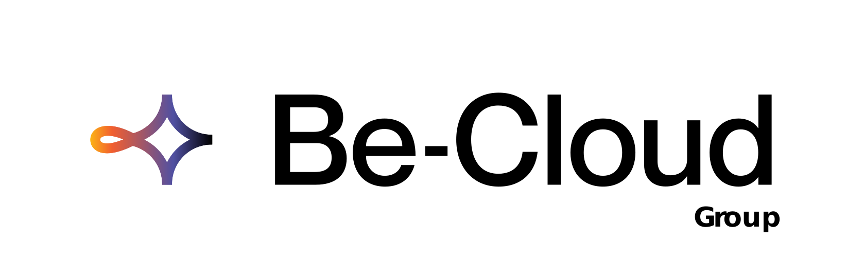
With baseline (large formats)
Large formats

The Be-Cloud logo has two elements: the icon and the wordmark. Together they identify the brand instantly, and they should always be used together apart from exceptional cases.
Large formats
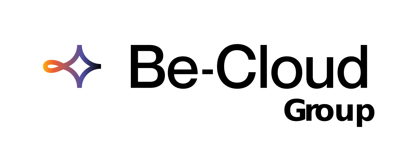
Medium formats
Medium formats, wide spaces

Small formats, avatars, favicons
These versions keep the logo legible at every size.
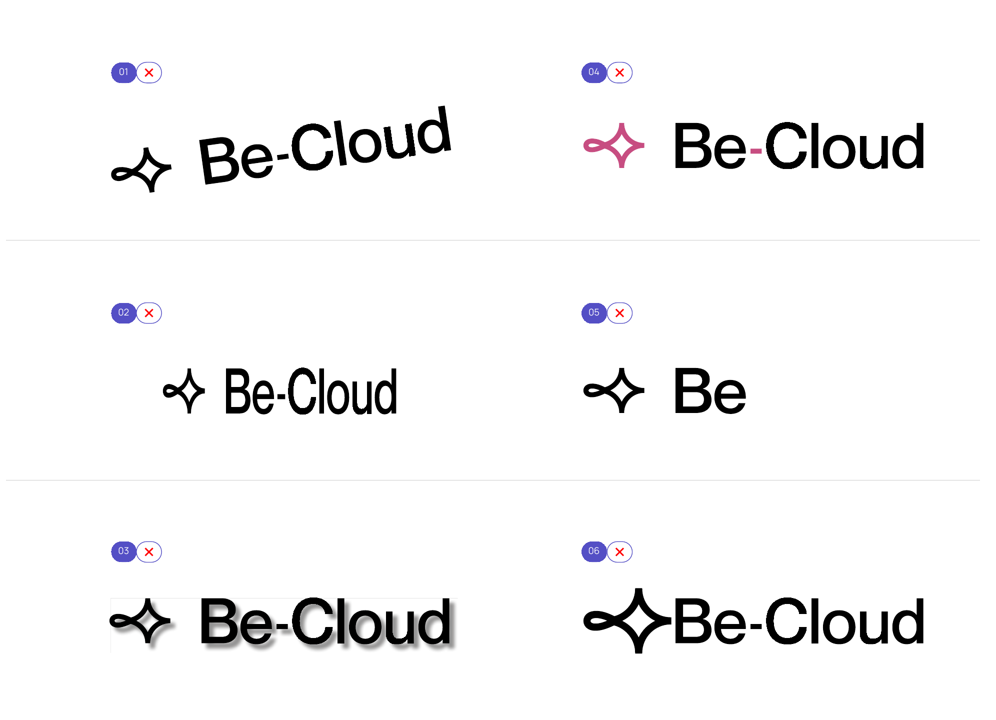
The logo colour adapts to its background. On a light background it appears in a dark tone; on a dark background it switches to a light version. The same rule applies when the logo sits on imagery or photography.
The official pack delivered by the agency, in RGB. Two brands — Be-Cloud Group and Be-Cloud — each in two-colour, monochrome, icon-only and coloured-background versions. Every file comes as SVG (web and vector print), PNG (transparent) and JPEG (white background).
Primary version: icon and wordmark, with or without the baseline.
A single colour, for constrained uses or busy backgrounds.
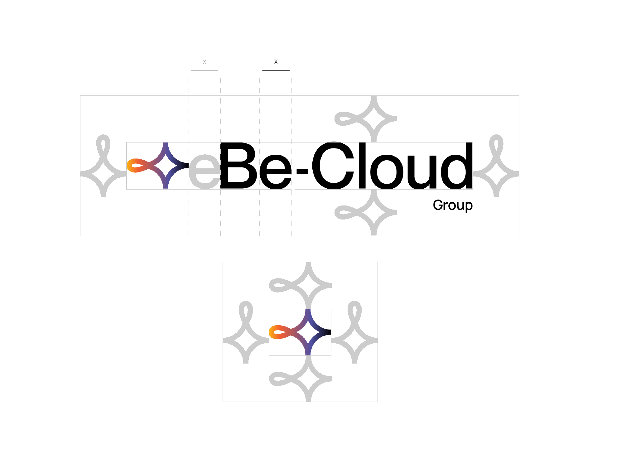
A clearspace zone protects the logo's legibility and keeps other visual elements away. The width of the letter “e” sets the minimum gap between the icon and the wordmark.
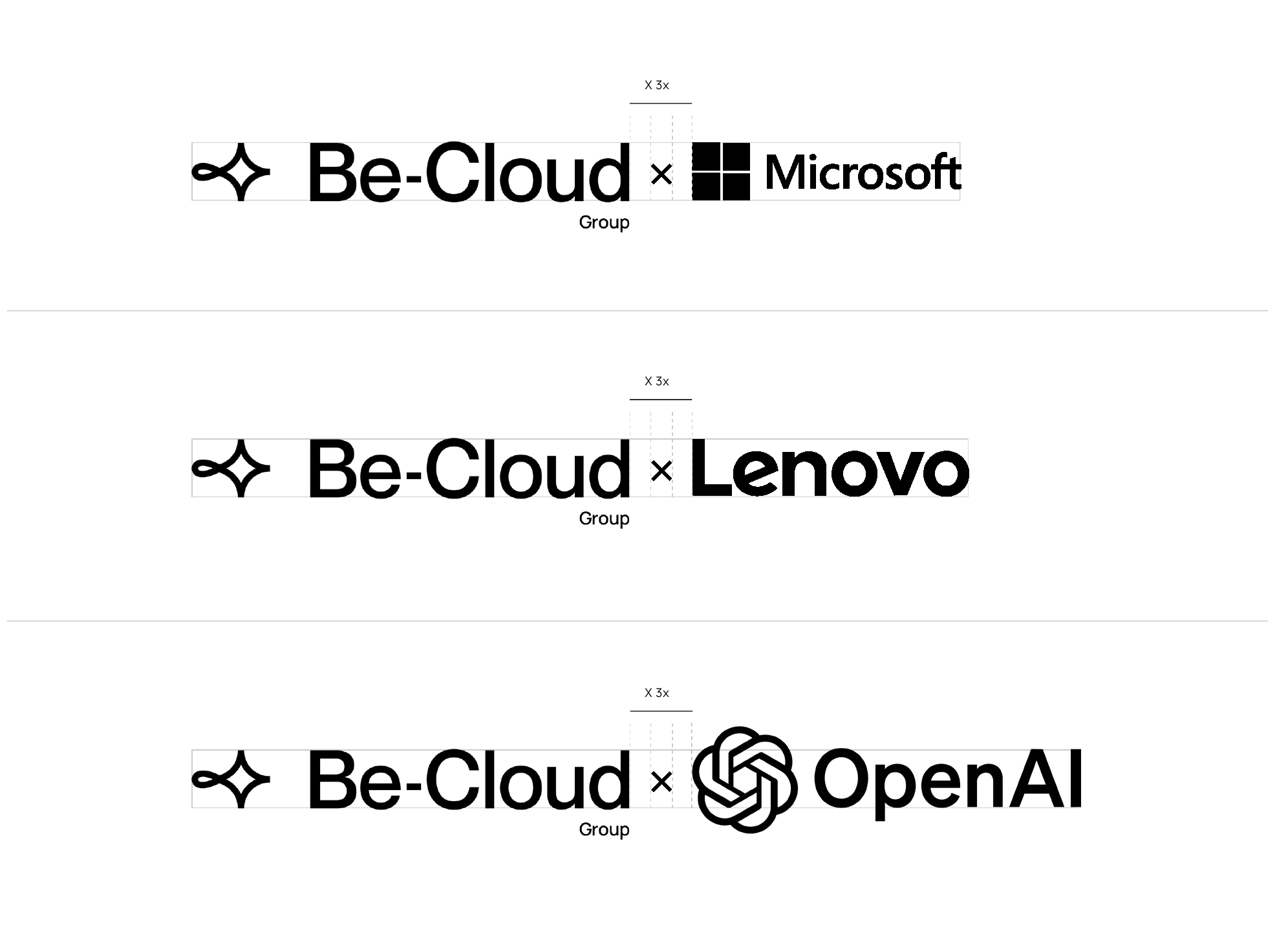
The logo can appear alongside a partner's. The two are separated by a small cross that acts as both a visual marker and a standard 3x spacer. The partner logo must never exceed the height of ours, minor overhanging details aside. A logo with variable composition, such as OpenAI's, is aligned optically on its wordmark rather than on its icon alone.